Projects
World Models and Consistent Mistakes in LLMs June, 2025
LLMs make consistent mistakes when given prompts that are rephrased or in another language. However, when given a substantially different prompt that relies on the same information, LLMs often give inconsistent answers.
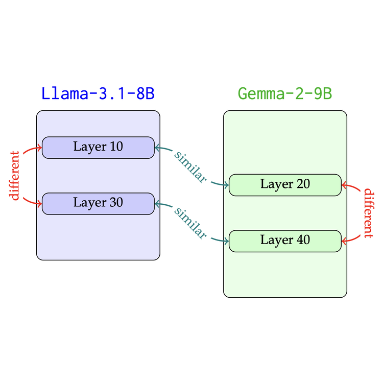
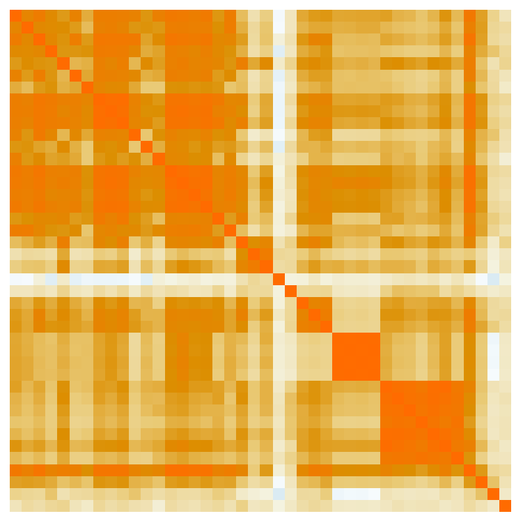
Layers at Similar Depths Generate Similar Activations Across LLM Architectures April, 2025
Independently-trained large language models generate activations that are similar between models, but not within models.
Do LLM's Learn Transferable Skills? September, 2024
When an LLM is trained to be good at one task, will it also get better at other tasks? For example, if an LLM is trained to be good at formal logic, will it also be good at making informal logical arguments? I investigate these questions by studying correlations in eval performance.
Optimal Ancient Alphabets and Letter Frequencies in Ugaritic July, 2024
I test a claim that the Ugaritic alphabet (one of the oldest alphabets) was designed to use fewer strokes to write the most frequently used letters.
Ancient Plagiarism? An Analysis of Claudius Ptolemy's Star Catalog September, 2023
Claudius Ptolemy was one of the most influential scientists of all time, but more recent analysis of one of his most important works led to claims of plagiarism. This project discusses some of the claims with new visualizations and some related analysis.

Dimensionality of Politics September, 2023
Politics can often be reduced to a single Left-Right dimension. However, “one-dimensional politics” cannot represent the nuance of inherently high-dimensional issues, so the dimensionality of politics can help measure the ability of politics to represent nuance. Using roll-call voting data from the US Congress, US Supreme Court, and the German Bundestag, it is possible to quantify the extent to which politics can be reduced to a single dimension, and more generally, how high-dimensional voting behavior is.
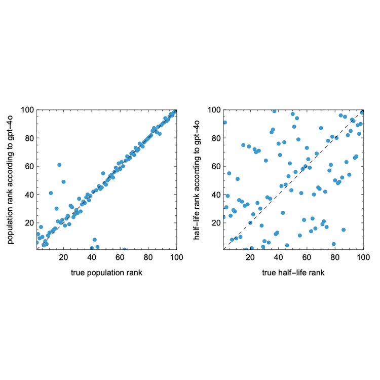
Lifespan of Wikipedia April, 2023
The goal of this project is to use survival analysis to study the lifespan of information on Wikipedia and Wikidata with the goal of understanding 1) how lasting contributions are made in collaborative projects, and 2) the ‘half-life’ of knowledge.
Ecosystem Dimension Reduction March, 2023
Characterizing ecosystems looking at the set of species that inhabit them by using 500GB of citizen science data.
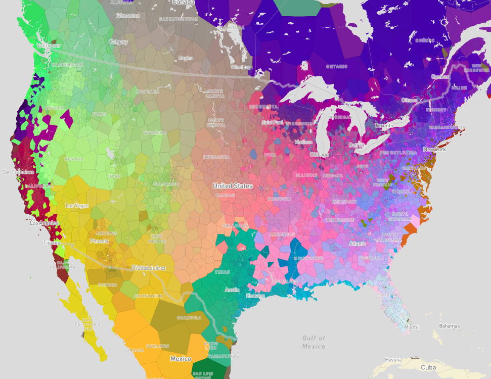
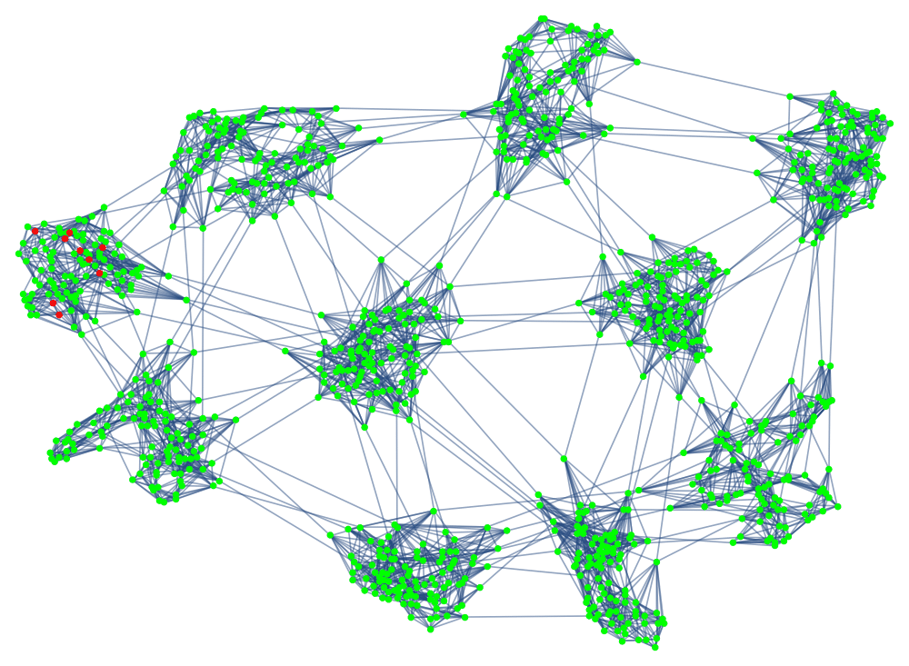
Multi-Scale Urban Communities October, 2022
By applying hierarchical community finding algorithms from network analysis to commuting flows from the US Census, it is possible to characterize and map socially-meaningful communities from giant megaregions, down to neighborhoods.
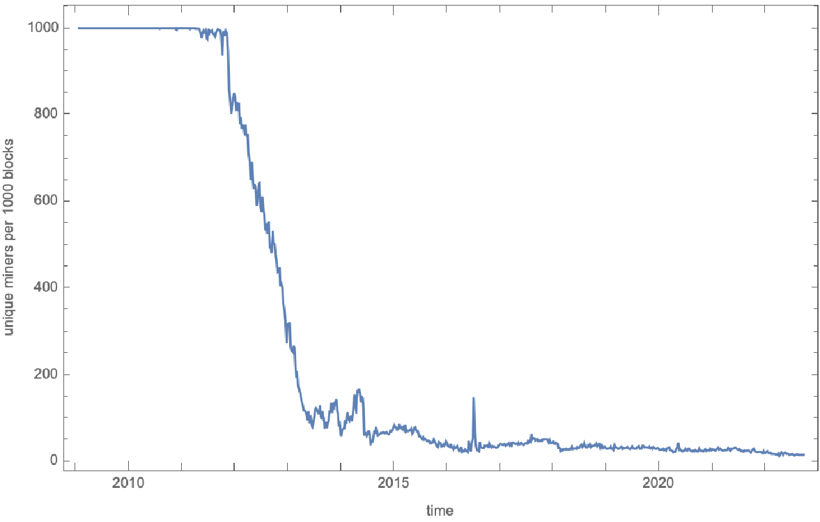
Centralization of Bitcoin September, 2022
During the course of another project, I wrote Rust code for parsing the entire ~500GB bitcoin blockchain and for extracting data on mining centralization. The result was these plots showing that bitcoin was highly decentralized until the early 2010s, when it rapidly centralized before entering a period of gradual centralization continuing into the present.
Voting Communities in the UN General Assembly September, 2022
The goal of this project is to apply methods developed in a previous project to characterize the geopolitical community structure of the UN General Assembly. Essentially, modularity-based clustering can be applied to the vote agreement network of the UN General Assembly to find communities of UN members that vote together. It is then possible to characterize changes in geopolitical alignment over time, most visibly with the fall of the Berlin Wall.
Chess Queen Armies With SAT Solvers September, 2022
The eight queens puzzle is a classic chess problem with the goal of placing eight queens on a chess board so that no two can attack each other. There is an extension of the eight queens puzzle with the goal of placing opposing “armies” of queens such that no two queens from opposing armies can attack each other. In this quick project, I use SAT solvers to efficiently find all possible non-isomorphic arrangements of queen armies on boards with all sizes up to 8x8.
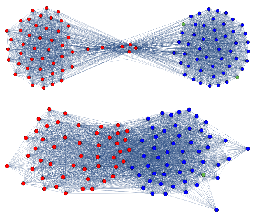
Network Analysis of Partisanship August, 2022
Over the last 230 years or so, the US Congress has met 117 times. In each of those sessions, hundreds to thousands of issues are put to vote. Certain issues are put to a “roll call vote”, in which the votes of the individual members are collected and recorded. Those records still exist going back to the 1st Congress in 1789. The goal of this project is to use that data to measure partisanship and political polarization over time, first in the US Congress, but later in the US Supreme Court and in the German Bundestag (the bodies for which the data is most readily available).
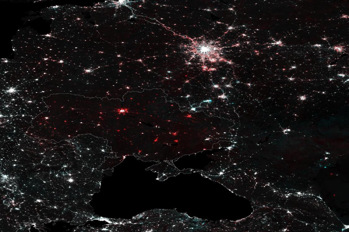
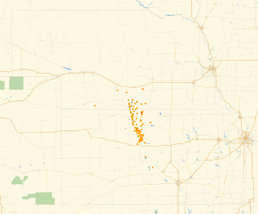
Nighttime Lights in Ukraine March, 2022
Data from NASA satellites shows how Ukraine has gotten darker in the weeks following the Russian invasion.
Finding the Hardest Spelling Bee Puzzle March, 2022
The Spelling Bee is a word puzzle published daily by The New York Times. The rules are very simple, which got me thinking about generating puzzles automatically. In this project, I created a metric for measuring the approximate difficulty of Spelling Bee puzzles, which I used to study the space of all Spelling Bees. In particular, I found the easiest and hardest puzzles, and also looked at how the subset of human curated puzzles published by The New York Times fit into the broader space.

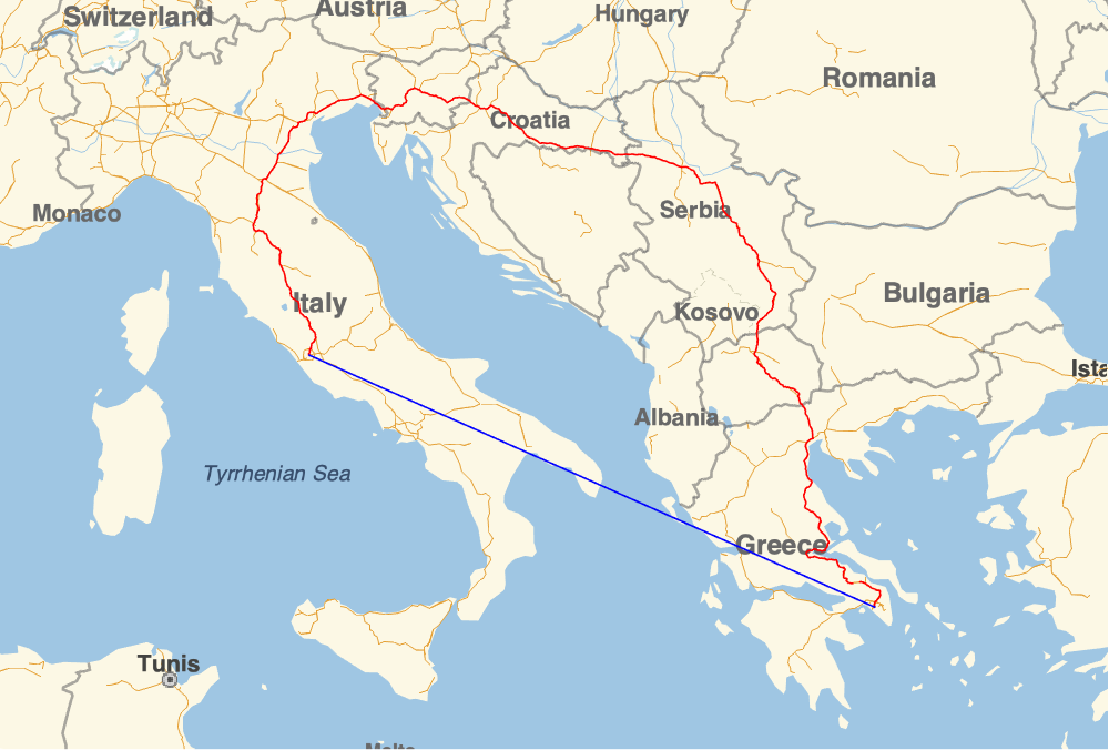
Efficiency of Road Networks April, 2021
For any two points on the Earth, the geodesic (as the crow flies) distance between them is usually different from the travel distance (along roads). For example, the fastest driving route from Boston to Dallas is about 1750 miles long, but the geodesic distance between Boston and Dallas (as the crow flies) is only about 1520 miles. By comparing the geodesic distance to the travel distance for millions of pairs of points, it is possible to measure the efficiency of road networks across distance and geography.
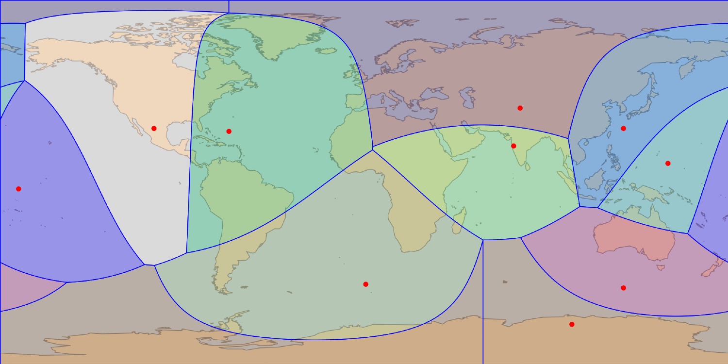
Geographic Voronoi Diagrams December, 2020
Voronoi diagrams are a useful geometric tool across a number of applications. However, most software which deals with Voronoi diagrams in the context of geography work by projecting the Earth to a plane, and then computing the euclidean Voronoi diagram. While this approach can give approximate results over small regions, it fails over larger ones. In this quick project, I implement spherical Voronoi diagrams in Mathematica, integrating with the existing Geo-functions.
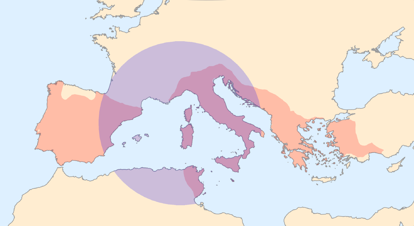
Map of Empire Density July, 2020
For any two points on the Earth, the geodesic (as the crow flies) distance between them is usually different from the travel distance (along roads). For example, the fastest driving route from Boston to Dallas is about 1750 miles long, but the geodesic distance between Boston and Dallas (as the crow flies) is only about 1520 miles. By comparing the geodesic distance to the travel distance for millions of pairs of points, it is possible to measure the efficieny of road networks across distance and geography.

Network Models of COVID-19 March, 2020
In March of 2020, at the beginning of the COVID-19 pandemic in the US, there was endless talk of disease spread modeling. Many models were studied without proper understanding of their sensitivity to arbitrary modeling assumptions. This paper explores a large space of network SIR models in search of robust results.
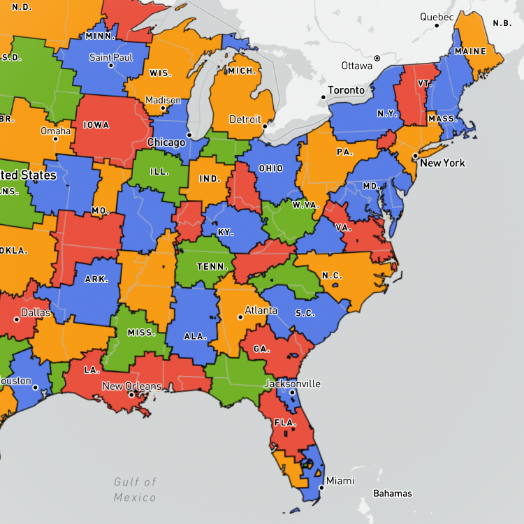
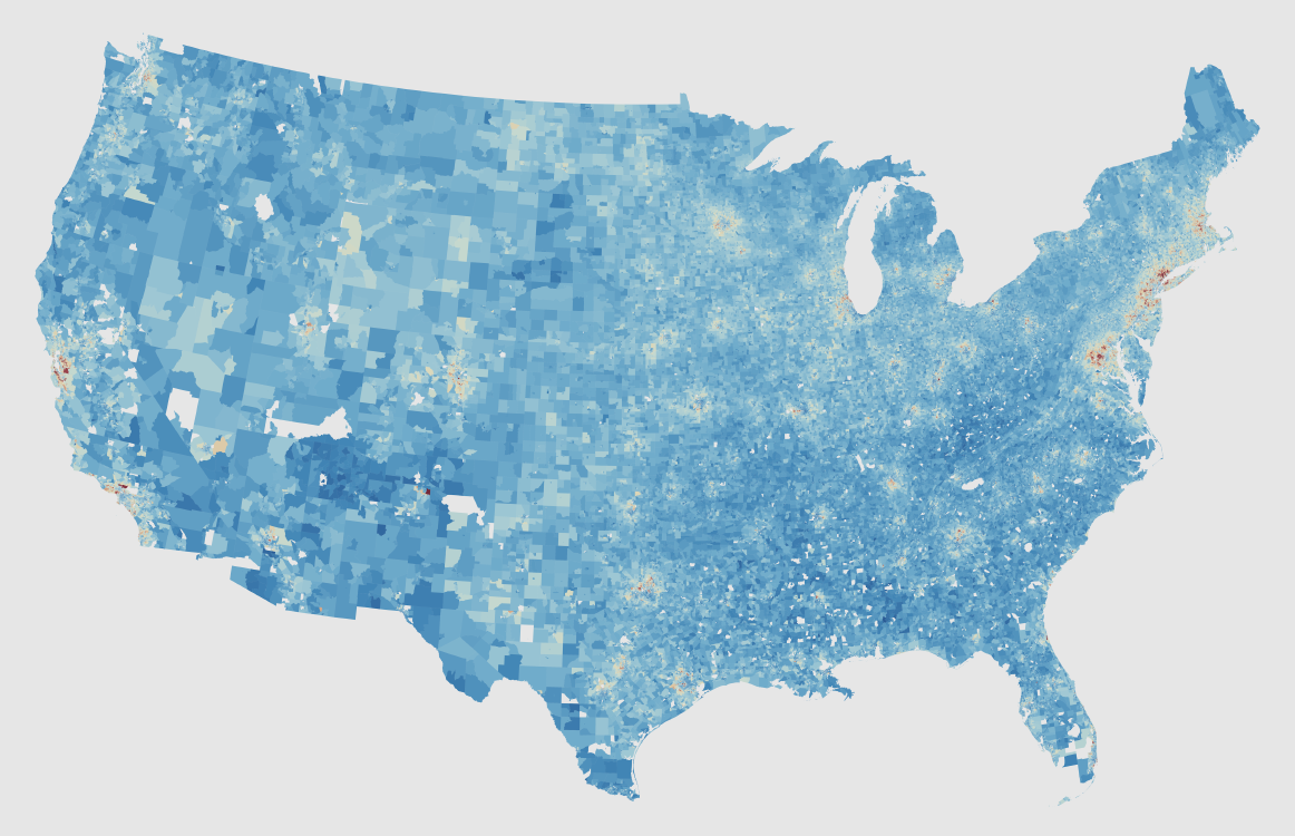
Highest-Resolution Income Map of the US March, 2019
I couldn’t find a high-resolution map of household income for the whole United States, so I decided to make one. This map uses the highest-resolution available data form the US Census 5-year ACS, which goes down to the block group level (each block group contains about 1000 people).
Rush Hour Game Graph Analysis December, 2017
Rush Hour is a logic puzzle board game in which the player slides “cars” around a grid with the goal of driving a particular target car to the exit. In this project, I generated the graphs of reachable configurations from each of those 40 starting configurations, with the goal of measuring whether differences in the topology of the game graphs correlate with the subjective difficulty of the puzzles for humans.
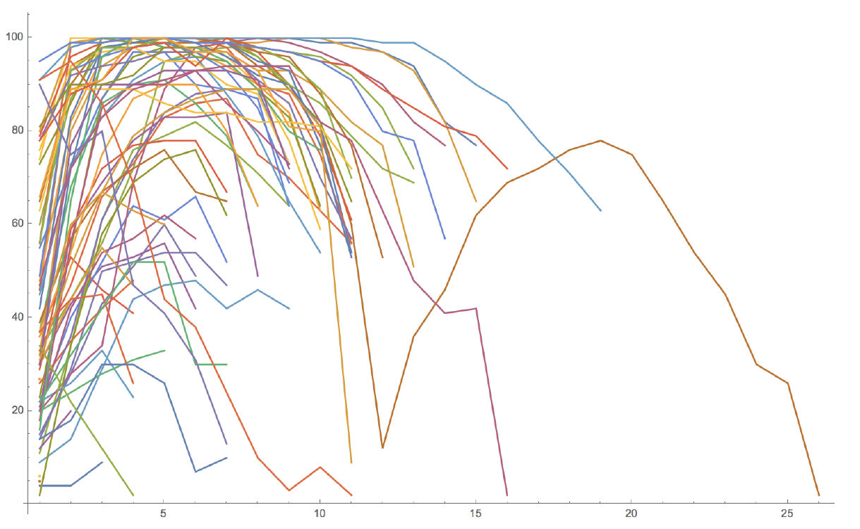
Lifespan of News Stories October, 2017
News stories have a life cycle: they break, they are covered for a while, and then they fade into irrelevance. The goal of this project was to quantify the lifespan of news stories, and to study how that lifespan has varied over time.
Where Is the Center of the US? July, 2017
Where is the geographic center of the US? According to the National Geologic Survey, the center of the conterminous US is at 39°50’N 98°35’W, and the center of all US states (including Alaska and Hawaii) is at 44°58’N 103°46’W. The thing is, the center of a region on the globe is not entirely well defined. That is, there are multiple ways of characterizing the center of a region like the US.
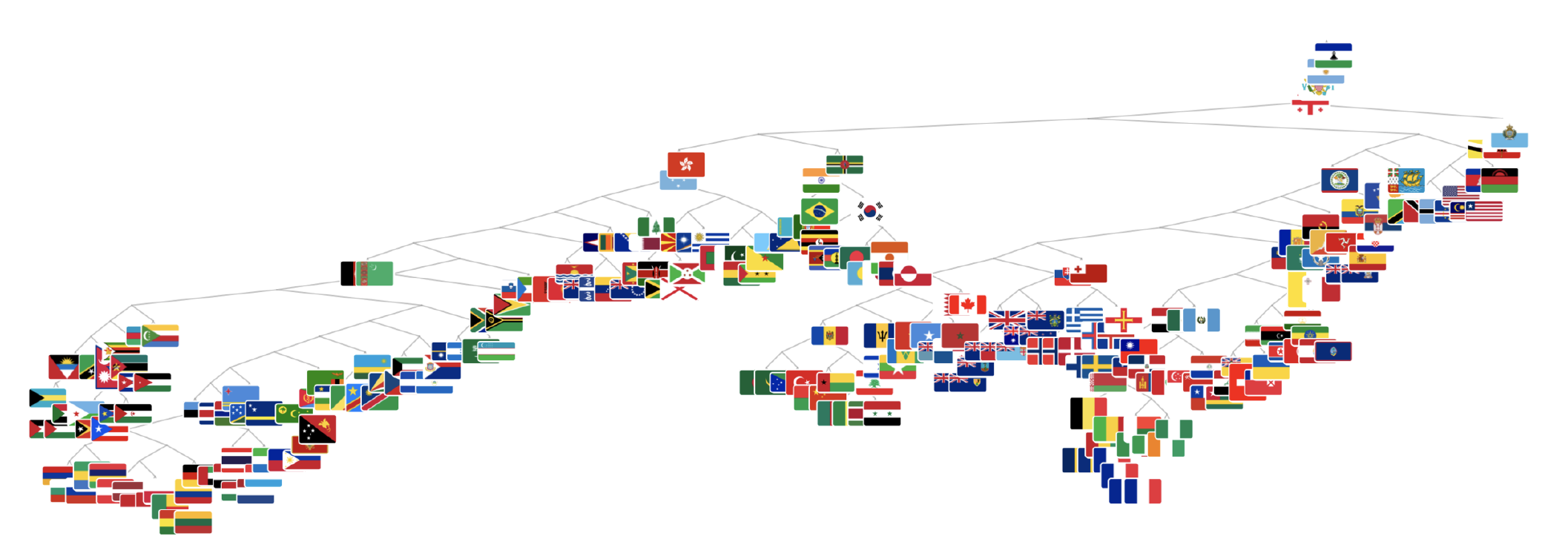
Flag Analysis February, 2017
I trained a variational autoencoder (VAE) on a set of thousands of flags from around the world, making it possible to generate new flags and to measure the “probability” of existing ones. My original goal was to quantify whether distance in flag space is correlated to distance in geographic space, but all of my results were negative, and the dataset I used made it difficult to connect flags to geography.
Functional Completeness and Optimization November, 2016
Some logical connectives (boolean functions like AND, OR, and NAND) are functionally complete, which means they can be used to emulate any of the other logical connectives. The property of functional completeness is crucial to chip design, as it makes it possible to build a fully-functional chip while only manufacturing a single type of gate. While the 2-input connectives are well-studied, their 3-input counterparts are less so. This project uses dynamic programming to find minimal expressions for using 3-input logical connectives to represent other 3-input logical connectives. In doing so, I answer the question of which connective you would want to use if you wanted to create a computer with 3-input gates assuming you wanted to minimize the number of gates. Spoilers: it isn’t the choice that the Apollo Guidance Computer made (which used 3-input gates).
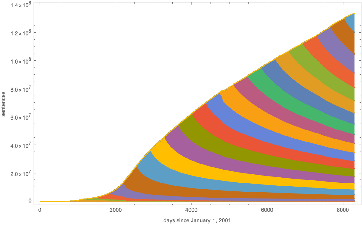
Billboard Hot 100 Analysis September, 2016
Since 1958, Billboard magazine has been publishing its Hot 100 list of the 100 “hottest” songs every week (based on sales, radio play, streaming, etc.) Using data from the Billboard website, I was able to study the rise and fall of individual songs, albums, and artists, as well as the dynamics of the music industry as a whole.
Aspect Ratios of Historical Societies May, 2016
In his book Guns, Germs, and Steel, Jared Diamond proposed that societies grow in accordance with regional differences in climate, and that because climate varies more drastically when moving north-south than when moving east-west, large societies will grow faster east-west than north-south. I characterize aspect ratio for regions on the globe and find that societies are on average wider than they are tall, supporting Diamond’s claim. However, I also find a similar effect with small and large societies, suggesting another underlying cause. I then investigate the first part of Diamond’s claim, and find that societies do not grow in accordance with climate in the manner he predicts.
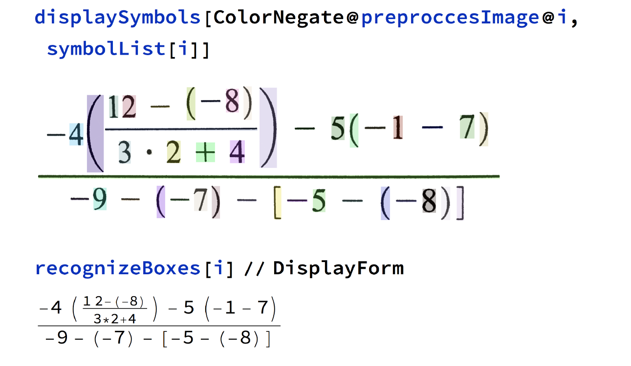
Math OCR July, 2015
In 2015, CNN-based OCR was in its infancy, and traditional tools for OCR relied on there being a single baseline for the target text. I developed some strategies for performing OCR on mathematical expressions using a combination of machine learning for character recognition with more traditional approaches to put those characters together into a larger expression. My work was eventually turned into US Patent 20170091597A1.
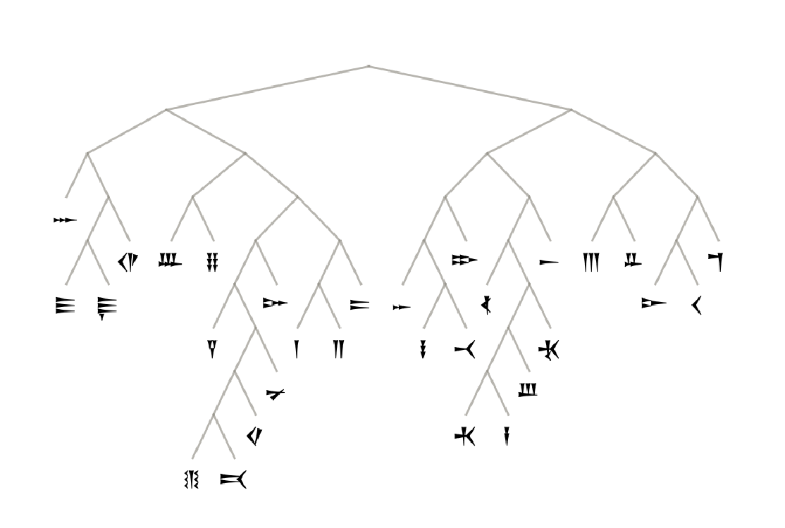
Science Consulting on Arrival May, 2015
I worked as a science consultant on the science fiction movie Arrival (2016) which centers around a linguist trying to understand an alien language. My role was to perform realistic computer analysis of the fictional alien script which could be shown on screens throughout the movie.

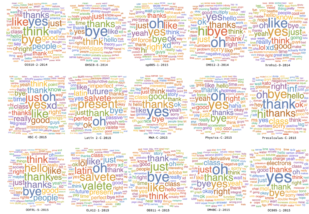
Education Analytics of an Online Classroom February, 2015
Back in 2015, while I was a Sophomore at the Stanford Online High School (OHS), I wrote a series of programs for extracting and analyzing data from recordings of my online classes. I was able to generate tons of class-specific statistics, like the “agreement” network of students in the text chat, as well as more general results, like that the amount and type of student participation varied when the teacher was replaced, etc.
Phase Diagram of Boids September, 2014
Boids is a simple model of flocking behavior which has been used to simulate the movements of birds in a flock, fish in a school, etc. Boids is one of the classic examples of emergent behavior, with simple and local rules producing complex global behavior. I create an efficient implementation of boids and used it to study how their global behavior changes with the parameters of the individual agents.
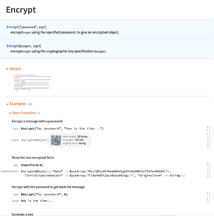
Cryptography System for WL June, 2014
I was the primary developer of the original cryptography functions shipped with every copy of Wolfram Language (Mathematica) since 2015 (version 10.1). Those functions include Encrypt, Decrypt, GenerateSymmetricKey, GenerateAsymmetricKeyPair, EncryptFile, DecryptFile, EncryptedObject, SymmetricKey, PrivateKey, PublicKey. Most of the functionality was backed by OpenSSL.
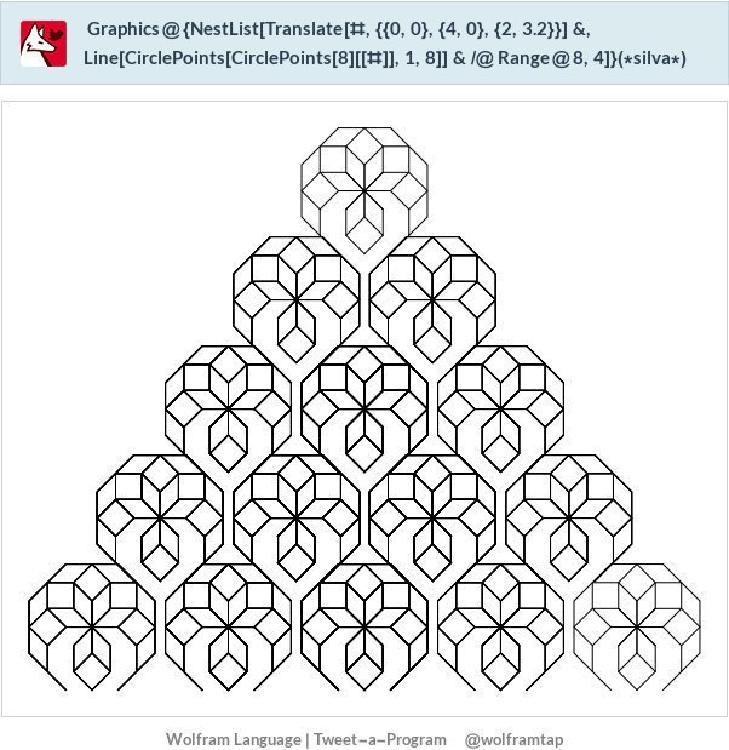
Wolfram Tweet-a-Program January, 2014
I created the original version of the Wolfram Tweet-a-Program (TAP) bot. TAP was a relatively early Twitterbot which recieves tweets containing WL code, evaluates the code, and then responds with a screenshot of the result. The goal was to showcase what is possible with only 140 characters of WL code (the answer being: quite a lot!)
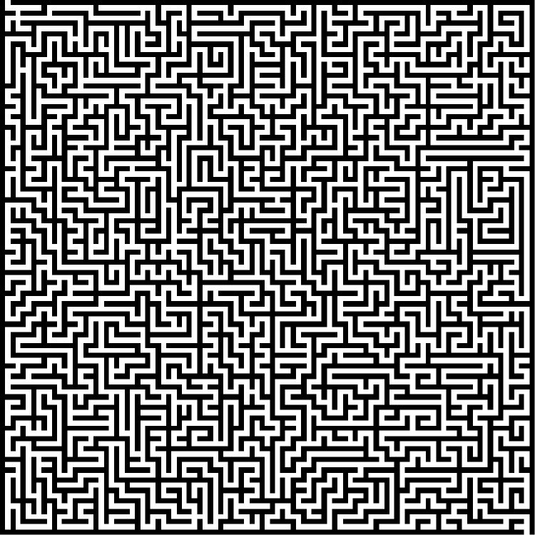
Maze of Mazes July, 2013
Back in 2013, I implemented several maze generation algorithms. I wanted to make a giant maze, but the algorithm that generated the best mazes wasn’t very efficient, so I made a maze made up of smalller mazes instead.