Map of Empire Density
July, 2020
I’ve been interested in the quantitative study of history for some time (see this project). Recently I saw a paper by Turchin et al. which contains a map of "imperial density", showing for each point on the earth, how many centuries that point was inside of a large empire (defined as any society larger than 100,000 km2). In other words, the map shows the spatial distribution of large empires.
I thought I would try making a higher resolution (in both space and time) version of their map using some data that I had used in a previous project. The data in question is the "Polygon" field of the "HistoricalCountry" entity type in Wolfram Language / Mathematica, which gives the approximate shapes of historical societies throughout history. That dataset is primarily derived from the GeaCron project which in turn is derived from historical atlases.
I would include the code used to make these maps, but a bug in the current version of WL means that it is difficult to extract all of the necessary polygons. I got the data by extracting it from the internal source of the HistoricalCountry entity type, but I don’t think I should share that messy raw data here. I’ll try to update this post with code once the bug with the entity functions is fixed.
I started by calculating the areas of all of the society polygons in my dataset, and then found the time intervals over which each society was larger than 500,000 km2. (Turchin et al. use 100,000 km2, but I found this to be too inclusive given the number of societies in the dataset. For reference, Kentucky is about 105,000 km2.) I then made maps of those large societies in those intervals, and composed them together. This gives us the overall map of empire density, taking into account all empires from 1000 BCE to the present:
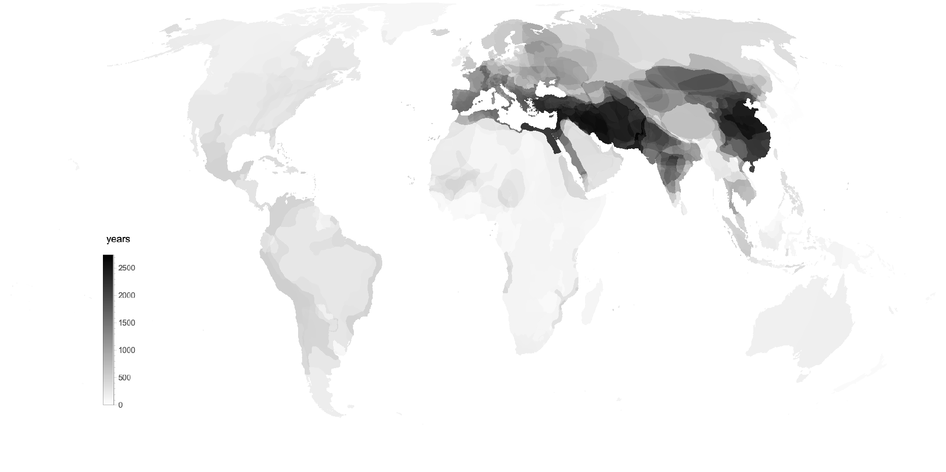
It seems that the two highest imperial density places were Persia and China.
I also created an animated version of this map, showing how the spatial distribution of empires has changed over time.
You can see the early empires forming in China and Mesopotamia, before expanding to all of Persia. With Rome, the empires spread to surround the Mediterranean and then north into Europe. Near the end there is a shift away from Europe and to the north. At the very end we see the world light up because although most modern states are smaller than 500,000 km2, most of the world is covered by states larger than 500,000 km2.
It is important to note that many of these shifts could just reflect changes in the availability of data. For example, remote societies without writing are unlikely to be represented unless they had significant contact with a literate society, so the shift toward more steppe empires could just increasing contact with other, literate societies.
Edit: Here is another animated version of the map which shows empire density for the period from 1000 BCE to y as y ranges to the present: