Voting Communities in the UN General Assembly
September, 2022
In a previous project, I used modularity of voting networks to characterize the strength of partisanship over time in the US Congress, US Supreme Court, and the German Bundestag. This is a continuation of that project, applying similar methods to find geopolitical communities in the UN General Assembly that are vaguely analogous to political parties.
Previously, I used network modularity to characterize the strength of partisanship by measuring how well political parties line up with communities in the vote agreement network. In that scenario, the communities (political parties) were known, and the goal was to compute how strongly they correlated with voting behavior. The goal here is to use similar methods to characterize geopolitical communities in the UN General Assembly.
In the voting bodies considered before, the set of communities that maximizes modularity is generally defined by political parties. Therefore, by finding communities that maximize modularity in the UN General Assembly, it is possible to find geopolitical communities that are vaguely analogous to political parties (in that there is more agreement within communities and less agreement between communities). Doing so makes it possible to characterize broad geopolitical dynamics over time.
Finding Communities
Using data from Voeten, Strezhnev, and Bailey, I constructed the vote agreement network for the 75th session of the UN General Assembly, which ran from 2020 to 2021. Each vertex of the vote agreement network is a UN member, and an edge is added between two members any time they vote the same way (including abstaining). Feeding that network into a modularity-based clustering algorithm gives these communities:
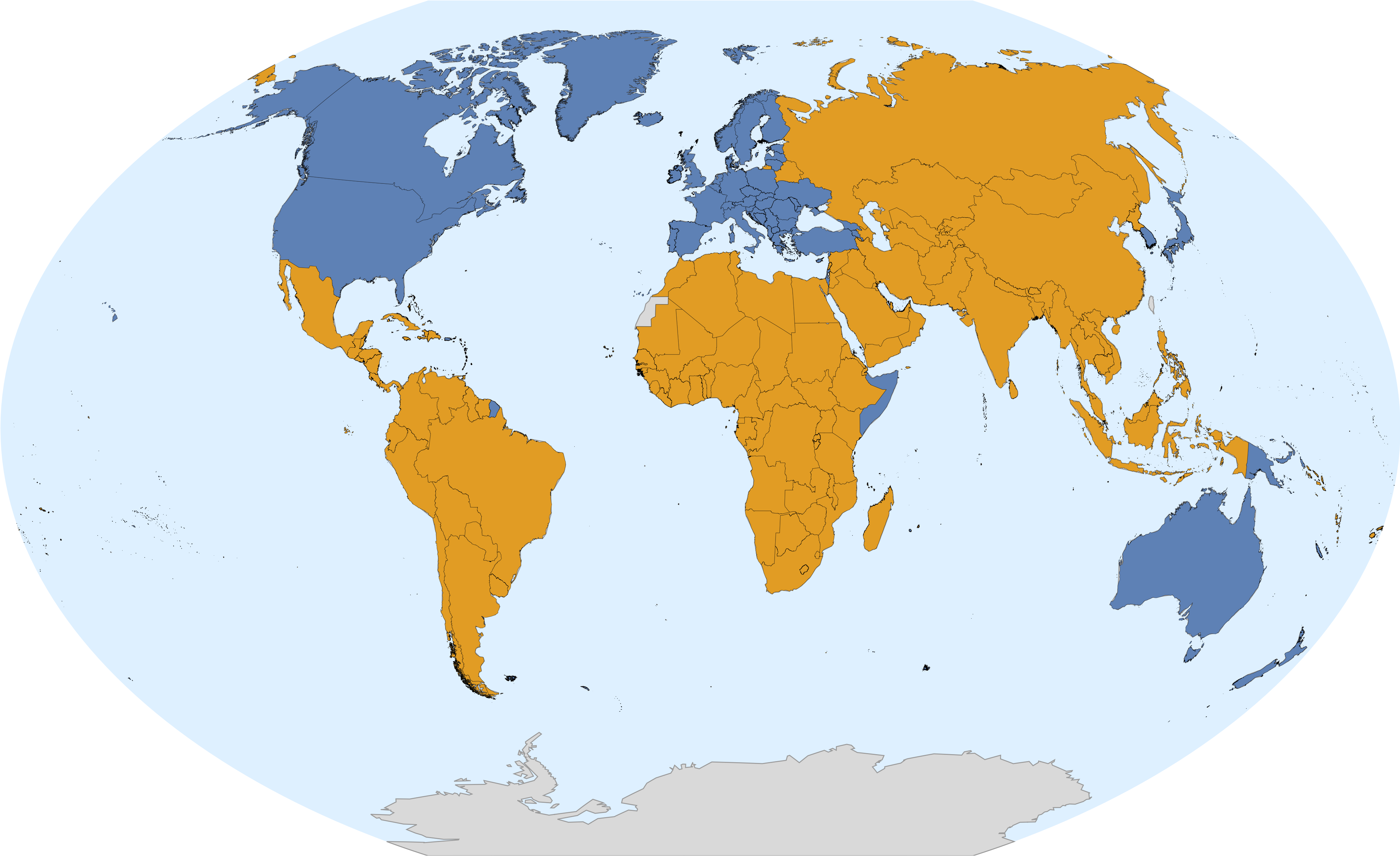
The result is two large clusters. The blue cluster contains the US, Europe, several Commonwealth countries (Canada, Australia, New Zealand, Papua New Guinea), as well as Japan and South Korea. The orange cluster contains every other UN member.
The blue cluster generally aligns with developed countries (as classified by the IMF and UN). However, looking at changes in the clusters over time complicates things:
One of the notable shifts comes with the fall of the Soviet Union. Most Eastern European countries, which had been aligned with the Soviet Union, suddenly switch from orange to blue. These countries did not suddenly become "developed" overnight (and are still not considered developed according to the IMF and UN).
The rapid change suggests that community membership is not just a reflection of something like economic development, but is determined by geopolitical alignment. In this case, the blue cluster roughly corresponds to "Western-aligned" countries, while the orange cluster contains everything else.
Modularity Over Time
This plot shows the optimal modularity as a function of time:

Modularity appears to be high and rising following World War II, peaking around 1960. After that point, it gradually declined (with significant fluctuations) before leveling out around 1970. However, modularity increased again with the fall of the Berlin Wall and has remained level ever since.
Measuring the Strength of Community Membership
The maps above assign countries to communities, but they do not say how central they are to those communities. For example, France and Turkey are both members of the Western-aligned community, but which one is "more" Western-aligned?
The map above was generated by finding a set of communities that maximize modularity. Therefore, switching a country from its optimal community to another should reduce modularity. If a country is central to its community, switching it will reduce modularity more than if it were a peripheral member.
Taking advantage of this, we can measure each country's alignment to each community by measuring how much modularity would change were it switched to that community. For example, if France is switched to the non-Western-aligned community, then the modularity drops by about 0.0024. However, if Turkey is switched, the modularity only drops by 0.0014.
Defining each country's Western affinity by its alignment to the Western community minus its alignment to the non-Western community, we get this map of Western affinity:
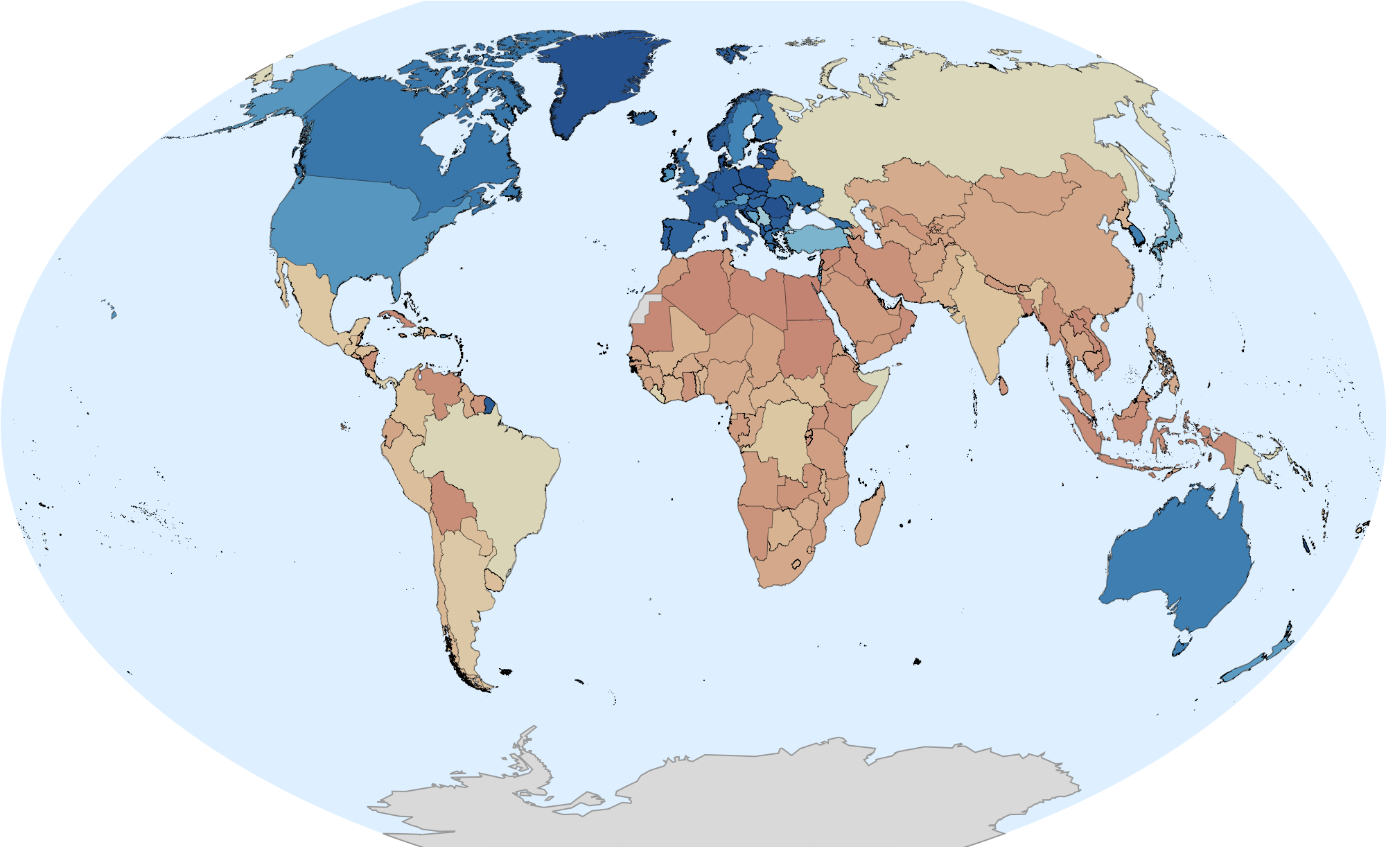
Most members of the Western-aligned community appear to be more committed to their community than non-Western aligned ones. For example, countries in Europe have far higher positive Western affinity than places like Russia or China have negative Western affinity.
Here is an animated version of the same map, using data going back to 1946:
In the historical data, there was far more non-Western affinity until the early 1970s, when things seemed to mellow out (as noted earlier). Around that time, South America also switches from being Western-aligned to non-Western-aligned.
Western Affinity Over Time
This plot shows Western affinity over time for a few characteristic countries:

These curves are fairly typical. Most European countries follow a path similar to the US, starting with high Western affinity before becoming more neutral around 1970.
Russia / the USSR follows a typical path for most non-Western-aligned countries up until the fall of the Berlin Wall, at which point it briefly had strong Western affinity, before dropping to a neutral position.
China's behavior after the fall of the Berlin Wall is typical for most non-Western-aligned countries, with slightly decreasing Western affinity before leveling off.
Post-Soviet Trajectories
One interesting case study is the divergence of various post-Soviet states after the fall of the Berlin Wall.

As with Russia, most post-Soviet states had a brief period of high Western affinity in the early 1990s. However, some states like Ukraine diverged and continued to gradually align more with the West. Finally, the Baltic states immediately aligned with the West and stayed that way.
Plot Your Own
I made a simple form which lets you make plots like the ones above for any set of UN Members, which is available here. I found Argentina and Brazil to be particular interesting.
Code
A notebook with all code needed to reproduce this project is available here.
Data Sources
UN General Assembly Voting Data
Bailey, Michael A., Anton Strezhnev, and Erik Voeten. "Estimating dynamic state preferences from United Nations voting data." Journal of Conflict Resolution 61.2 (2017): 430-456. DOI: https://doi.org/10.7910/DVN/LEJUQZ