Multi-Scale Urban Communities
October, 2022
As part of the ACS, the US Census surveys about 3.5 million households each year with the question "At what location did this person work last week?" It compiles the responses into a dataset of commuting flows which gives the approximate number of workers who commute between any two census tracts (which are regions containing about 4,000 people).
These commuting flows can be interpreted as a network, with each vertex representing a census tract, and a directed edge from the home to the workplace of each commuter. The idea here is to apply standard community finding algorithms to the commuting network. This has been done before in various forms, but here I use a different dataset, and I apply the community finding algorithm repeatedly to generate a hierarchical clustering, showing everything from small town units to megaregions.
Hierarchical Clustering of the Commuter Network
I applied a modularity-based clustering algorithm to find a set of communities \(coms\) in the commuter network. In order to find sub-communities, I applied the clustering algorithm to each of the resulting communities. Let's call this operation \(refine(coms)\). In order to find super-communities (megaregions), I combined each of the communities into single units and applied the clustering algorithm to get the "communities of communities". Let's call this operation \(coarsen(coms)\).
There are many combinations of these operations that I could have generated. However, I found that these four layers of hierarchy were the most interesting:
- Megaregions: \(coarsen(coms)\)
- Broad urban areas: \(coms\)
- Cities: \(refine(coms)\)
- Sub-cities: \(refine(refine(coms))\)
These all all shown on the interactive map below. At the default zoom level, this shows the megaregions, but zooming in reveals the broad urban areas, the cities, and the sub-cities:
(I highly recommend pressing the button to make the map full screen and playing around.)
At this point it is important to note that the algorithm that generated these regions knows nothing about geography or political boundaries. It only knows about the number of commuters traveling between pairs of census tracts. The fact that the regions are mostly connected is purely emergent, as is any alignment with political boundaries.
Observations From the Map
At the megaregion level, regions like Northeast and Mid-Atlantic, the Southeast, etc. emerge. Most commutes are far smaller than any of these regions, so the fact that they align with our expectations is nontrivial.
Zooming in, the next level in the hierarchy has regions for every major urban area:
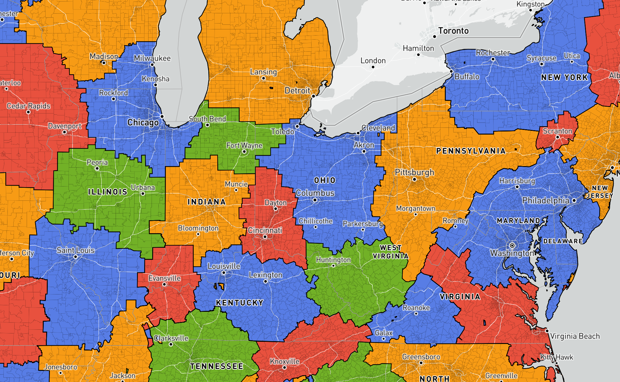
It's interesting how compact these regions are, and how they follow a Voronoi-like pattern (specifically, it looks like a power diagram).
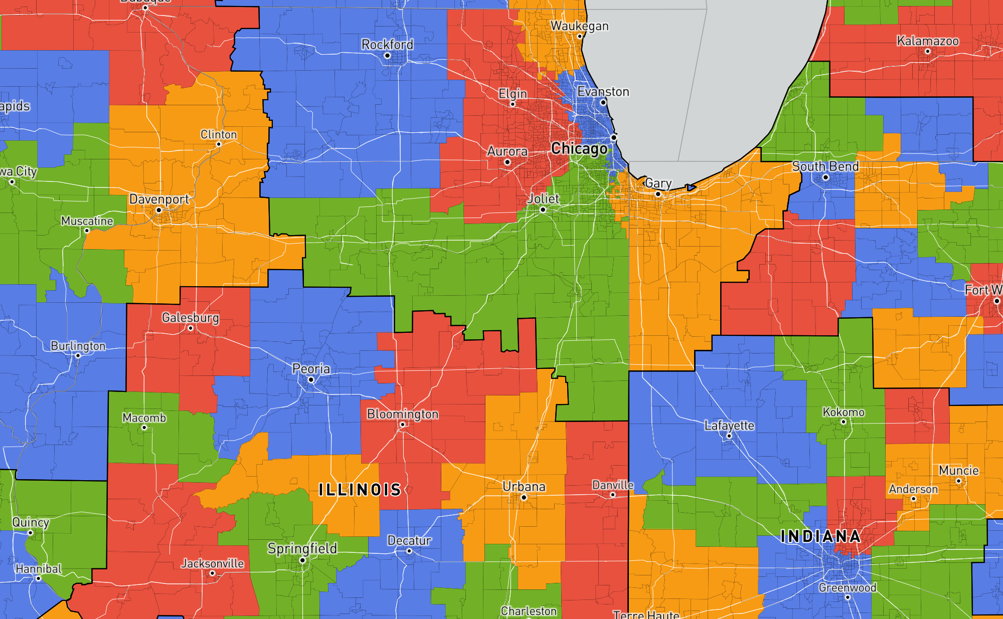
Focusing on Illinois as an example, Chicago is contained in a large urban region (as it should be), while the smaller cities of Central Illinois have their own region.
Zooming in further, the Central Illinois region breaks up into its constituent cities, while the Chicago suburbs split into western, southern, and Gary Indiana sections. Interestingly, the northern suburbs stay with the city itself.
Zooming in once more to the highest-resolution of communities that I computed, the southern and western neighborhoods of Chicago split off. Meanwhile, the northern neighborhoods stay more closely linked to downtown (as does Hyde Park which is home to the University of Chicago).
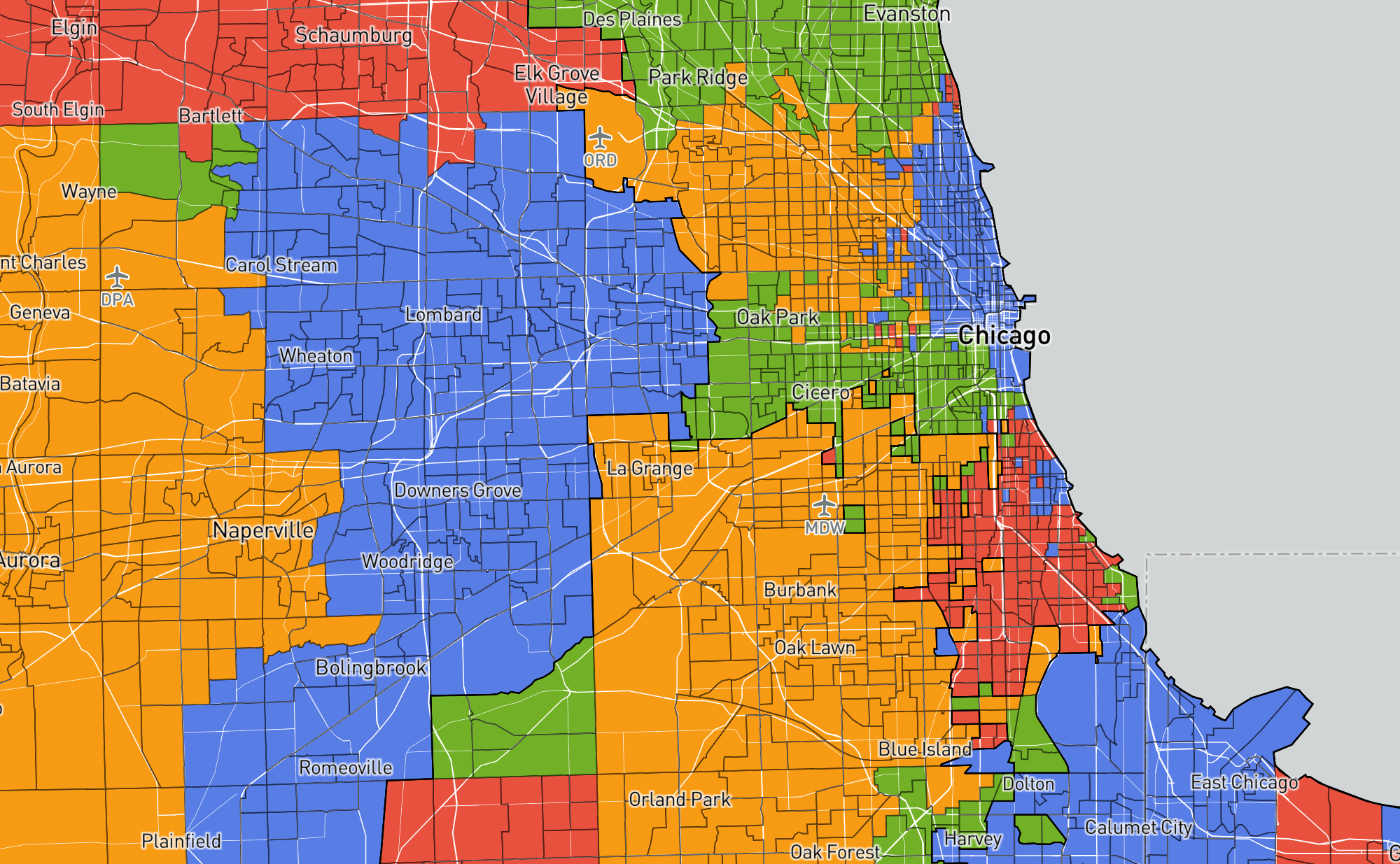
Though it is hard to say anything quantitative, these splits seem to generally correspond to what I would expect as a resident of Chicago.
Political Boundaries
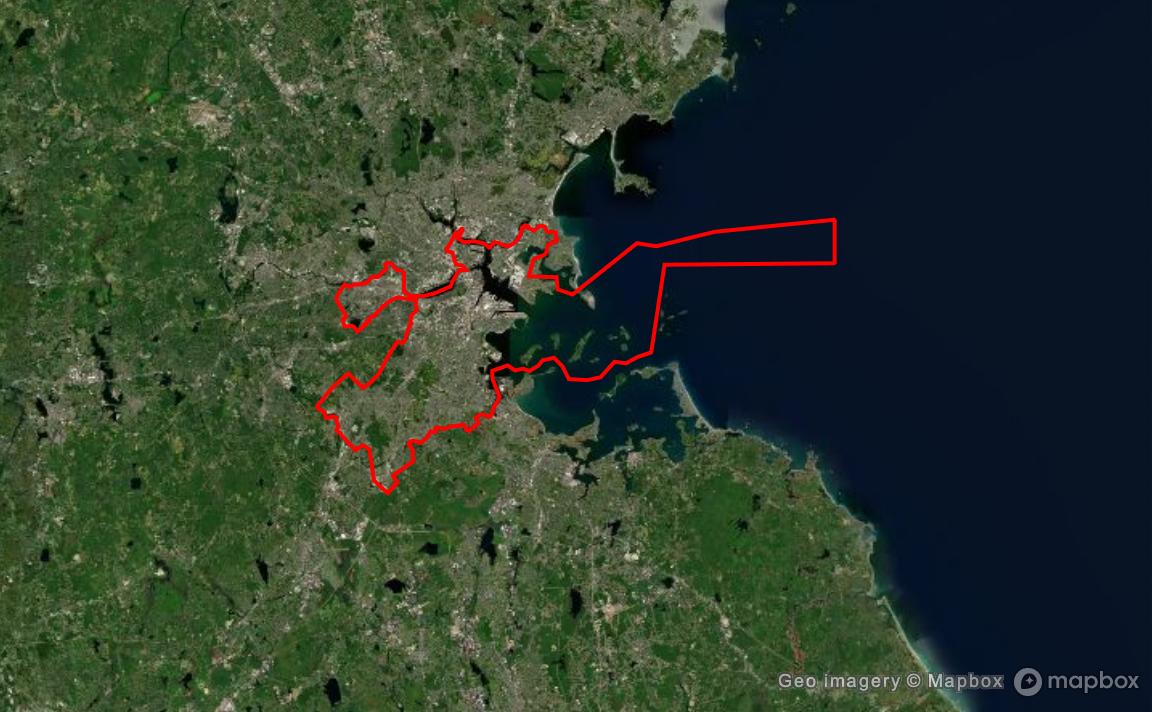
Official political boundaries often have little correlation with the actual community divisions. For example, this map shows the seemingly arbitrary borders of the city of Boston, swooping in and out of neighborhoods in ways that are largely invisible on the ground:
However, there are a few instances where the communities in the commuting network seem to correspond to political boundaries in places where it might seem like there was little division.
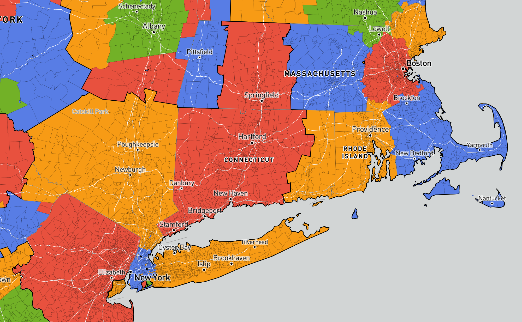
For example, some of the state borders of Massachusetts, Connecticut, and New Jersey are visible in these commuting communities:
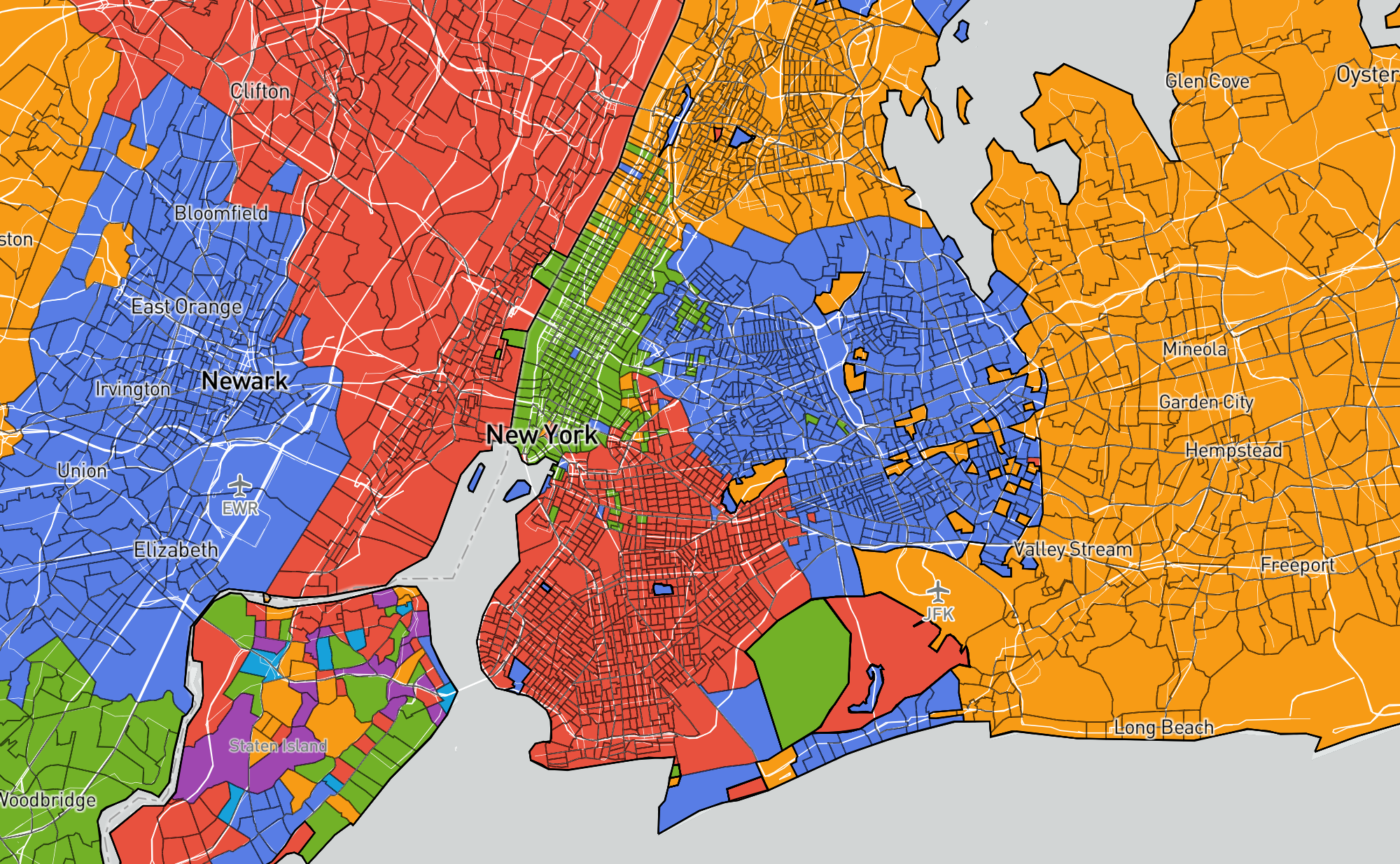
And New York breaks into its five boroughs:
There is lots more to see in that map, and I recommend exploring yourself. Also feel free to contact me to tell me whether this aligns with your expectations in regions you are familiar with.
Issues and Future Work
There are some issues with the map that I should point out, as well as some avenues for improvement.
One issue is that some communities seem to be "atomic", in the sense that they have no meaningful sub-communities. In these cases, the algorithm often breaks everything up into tons of meaningless sub-communities. This can be seen in Staten Island in the map above, as well as by zooming in too far on any small city.
Another more fundamental issue is that there is no way to control the size of communities that it finds. That is, I don't know if there is an intrinsic reason why the algorithm found communities of the size it did, and not bigger or smaller ones. I also don't know whether it would find radically bigger or smaller communities when given slightly different input data. I believe this issue can be solved with a different community finding algorithm, but I will save the results for a future post.